
This article is a translation of a Japanese article I posted earlier.
Here is how to write React components, which is currently a best practice in my mind.
I believe that the code will convey my intentions, so I will skip the explanation.
What to create #
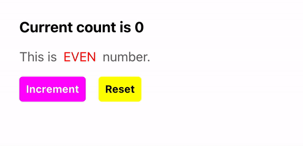
The above consists of the following files. pages/index.tsx is the entry point component.
├ pages/
│ ├ index.tsx
│ ├ Heading.tsx
│ ├ EvenOdd.tsx
│ ├ IncrementButton.tsx
│ └ ResetButton.tsx
└ types/
  └ index.ts
Common type definitions #
types/index.ts
export type Empty = Record<string, never>;

export type MayStyled<T extends object> = T extends Empty
  ? { className?: string }
  : T & { className?: string };

export type Styled<T extends object> = T & { className: string };

export type UnStyled<T extends object> = Omit<T, "className">;
Components #
pages/index.tsx
import styled from "@emotion/styled";
import { useState } from "react";
import { EvenOdd } from "./EvenOdd";
import { Heading } from "./Heading";
import { IncrementButton } from "./IncrementButton";
import { ResetButton } from "./ResetButton";
import type { Empty, MayStyled, Styled, UnStyled } from "types";

type Props = Empty;

const Hook = (_: Props) => {
  const [count, setCount] = useState(0);
  const increment = () => setCount((pre) => pre + 1);
  const reset = () => setCount(0);
  return { count, increment, reset };
};

const Component = (props: MayStyled<ReturnType<typeof Hook>>) => {
  const { count, increment, reset, className } = props as Styled<typeof props>;
  return (
    <div className={className}>
      <Heading count={count} />
      <EvenOdd className="even-odd" count={count} />
      <div className="buttons">
        <IncrementButton onClick={increment} />
        <ResetButton className="reset" onClick={reset} />
      </div>
    </div>
  );
};

const StyledComponent = styled(Component)`
  padding: 24px;
  > .even-odd {
    margin-top: 16px;
  }
  > div.buttons {
    margin-top: 16px;
    > .reset {
      margin-left: 16px;
    }
  }
`;

const FunctionalStyledComponent = (props: MayStyled<Props>) => {
  const { className, ...rest } = props;
  return (
    <StyledComponent
      className={className}
      {...Hook(rest as UnStyled<typeof props>)}
    />
  );
};

export const Home = FunctionalStyledComponent;
pages/Heading.tsx
import styled from "@emotion/styled";
import type { MayStyled, Styled } from "types";

type Props = {
  count: number;
};

const Component = (props: MayStyled<Props>) => {
  const { count, className } = props as Styled<typeof props>;
  return <h1 className={className}>Current count is {count}</h1>;
};

const StyledComponent = styled(Component)`
  font-size: large;
  font-weight: bold;
`;

export const Heading = StyledComponent;
pages/EvenOdd.tsx
import styled from "@emotion/styled";
import type { MayStyled, Styled, UnStyled } from "types";

type Props = {
  count: number;
};

const Hook = (props: Props) => {
  const { count } = props;
  const isEven = count % 2 === 0;
  return { isEven };
};

const Component = (props: MayStyled<ReturnType<typeof Hook>>) => {
  const { isEven, className } = props as Styled<typeof props>;
  return (
    <p className={className}>
      This is
      <span className={isEven ? "even" : "odd"}>{isEven ? "EVEN" : "ODD"}</span>
      number.
    </p>
  );
};

const StyledComponent = styled(Component)`
  color: #666;
  > span {
    margin: 0 8px;
    &.even {
      color: #f00;
    }
    &.odd {
      color: #00f;
    }
  }
`;

const FunctionalStyledComponent = (props: MayStyled<Props>) => {
  const { className, ...rest } = props;
  return (
    <StyledComponent
      className={className}
      {...Hook(rest as UnStyled<typeof props>)}
    />
  );
};

export const EvenOdd = FunctionalStyledComponent;
pages/IncrementButton.tsx
import styled from "@emotion/styled";
import type { MayStyled, Styled } from "src/types";

type Props = {
  onClick: () => void;
};

const Component = (props: MayStyled<Props>) => {
  const { onClick, className } = props as Styled<typeof props>;
  return (
    <button className={className} onClick={onClick} type="button">
      Increment
    </button>
  );
};

const StyledComponent = styled(Component)`
  padding: 8px;
  font-size: small;
  font-weight: bold;
  color: #fff;
  background-color: #f0f;
  border-radius: 4px;
`;

export const IncrementButton = StyledComponent;
pages/ResetButton.tsx
import styled from "@emotion/styled";
import type { MayStyled, Styled } from "src/types";

type Props = {
  onClick: () => void;
};

const Component = (props: MayStyled<Props>) => {
  const { onClick, className } = props as Styled<typeof props>;
  return (
    <button className={className} onClick={onClick} type="button">
      Reset
    </button>
  );
};

const StyledComponent = styled(Component)`
  padding: 8px;
  font-size: small;
  font-weight: bold;
  color: #000;
  background-color: #ff0;
  border-radius: 4px;
`;

export const ResetButton = StyledComponent;
Thank you for reading. #
I hope this article was helpful!