
補足
本記事は以下の記事を参考にしています。
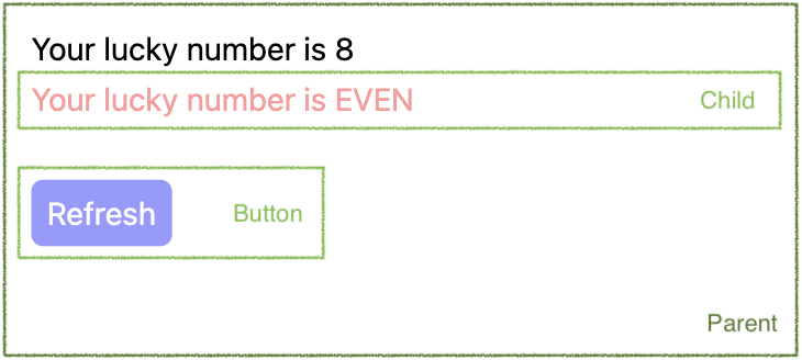
Parent / Child / Button の3つのコンポーネントからなるページを作成するとします。Parent コンポーネントが Child と Button の2つを内包している状態です。
このとき、それぞれのコンポーネントの特徴は以下の通り異なります。
- Parent:ページのトップのコンポーネント
- 特徴:見た目と振る舞いの両方の役割を持つ。プロップスを受け取らない。
- Child:Parent から呼び出されるコンポーネント
- 特徴:見た目と振る舞いの両方の役割を持つ。プロップスを受け取る。
- Button: 共通利用されるコンポーネント
- 特徴:見た目の役割のみを持つ。プロップスを受け取る。
上記の役割をもつコンポーネントを作成する時の記述方法の一案を以降で記載します。
ディレクトリ構成 #
本記事に登場する各ファイルは以下の構成で配置されています。このレイアウトは重要ではありませんが、各ファイル内の import 文はこの構成に基づいて記載されています。
└ src/
  ├ components/
  │ ├ atoms/
  │ │ └ Button.tsx
  │ └ pages/
  │   └ parent/
  │     ├ Container.tsx
  │     ├ Presenter.tsx
  │     └ child/
  │       ├ Container.tsx
  │       └ Presenter.tsx
  └ types/
    └ style.ts
各ファイル #
共有される型定義ファイル #
src/types/style.ts
export type MayStyled<T> = T & { className?: string };

export type Styled<T> = T & { className: string };
各コンポーネントから共通で利用される型定義です。使い方やその意図は以降のコンポーネントを見ていれば自然とわかると思います。
Button - 見た目の役割 & プロップスを受け取る #
src/components/atoms/Button.tsx
import styled from "styled-components";
import type { MayStyled, Styled } from "src/types/style";

type Props = MayStyled<{
  text: string;
  onClick: () => void;
  round?: boolean;
}>;

const Component = (props: Props) => {
  const { className, text, onClick, round } = props as Styled<Props>;
  return (
    <button
      className={round ? `${className} round` : className}
      onClick={onClick}
    >
      {text}
    </button>
  );
};

const StyledComponent = styled(Component)`
  padding: 8px;
  border: none;
  color: #ffffff;
  background-color: #9999ff;
  &.round {
    border-radius: 6px;
  }
`;

export const Button = StyledComponent;
従来の CSS 通り、クラス名(round)を付け外しすることによってスタイルを切り替えます。
Parent - 見た目と振る舞いの両方の役割 & プロップスを受け取らない #
src/components/pages/parent/Container.tsx
import { useEffect, useState } from "react";
import { Presenter } from "./Presenter";

const Hook = () => {
  const [luckyNumber, setLuckyNumber] = useState(0);
  const changeLuckyNumber = () => {
    const num = Math.floor(Math.random() * 10);
    setLuckyNumber(num);
  };
  useEffect(changeLuckyNumber, []);
  return {
    luckyNumber,
    changeLuckyNumber,
  };
};

const Container = () => {
  return <Presenter {...Hook()} />;
};

export const Parent = Container;
export type PresenterProps = ReturnType<typeof Hook>;
Container Component にあたるものです。
処理内容を Hook 関数として切り出し、その戻り値の型を export しているところがポイントです。
src/components/pages/parent/Presenter.tsx
import styled from "styled-components";
import { Button } from "src/components/atoms/Button";
import { Child } from "./child/Container";
import type { PresenterProps as Props } from "./Container";
import type { Styled } from "src/types/style";

const Component = (props: Props) => {
  const { className, luckyNumber, changeLuckyNumber } = props as Styled<Props>;
  return (
    <div className={className}>
      <h1>Your lucky number is {luckyNumber}</h1>
      <Child luckyNumber={luckyNumber} />
      <Button
        text="Refresh"
        onClick={changeLuckyNumber}
        round
        className="button-item"
      />
    </div>
  );
};

const StyledComponent = styled(Component)`
  padding: 16px;
  > h1 {
    color: #000000;
  }
  .button-item {
    margin-top: 24px;
  }
`;

export const Presenter = StyledComponent;
Presentational Component にあたるものです。
自身に1対1で対応する Container Component から使われることが決まっているため、プロップスの型定義もそこから import します。こうすることで型定義を記載する必要がなくなります。
Child - 見た目と振る舞いの両方の役割 & プロップスを受け取る #
src/components/pages/parent/child/Container.tsx
import { Presenter } from "./Presenter";

type Props = {
  luckyNumber: number;
};

const Hook = (props: Props) => {
  const { luckyNumber } = props;
  const isEven = luckyNumber % 2 === 0;
  return {
    isEven,
  };
};

const Container = (props: Props) => {
  return <Presenter {...Hook(props)} />;
};

export const Child = Container;
export type PresenterProps = ReturnType<typeof Hook>;
Container Component にあたるものです。
受け取るプロップスの型定義を記載すること、プロップスを Hook に渡している点が Parent(プロップスを受け取らないコンポーネント)と異なっています。
src/components/pages/parent/child/Presenter.tsx
import styled from "styled-components";
import type { PresenterProps as Props } from "./Container";
import type { Styled } from "src/types/style";

const Component = (props: Props) => {
  const { className, isEven } = props as Styled<Props>;
  return (
    <div className={className}>
      <p>Your lucky number is {isEven ? "EVEN" : "ODD"}</p>
    </div>
  );
};

const StyledComponent = styled(Component)`
  padding: 8px 0;
  > p {
    color: #ff9999;
  }
`;

export const Presenter = StyledComponent;
Presentational Component にあたるものです。
Parent(プロップスを受け取らないコンポーネント)と違いはありません。
ポイント #
Container と Presenter のファイルの分離 #
Container Component と Presentational Component のファイルを分離しています。Presenter 部分の修正だけ他の人にお願いするといったこともしやすくなります。
Container から Presenter に対する型定義の export #
Container が Presenter に渡すプロップスの型定義も export することで Presenter 側での型定義作業を不要としています。両コンポーネントが対になる関係であれば Presenter 側でわざわざ型定義を記載するのは冗長な作業であるため、これを回避しています。
クラス名の付け外しによるスタイルの切り替え #
Button コンポーネントで記載がありますが、プロップスとして渡される値に応じてクラス名を付け外しすることでスタイルを切り替えています。ここで CSS in JS の機能を使用しないことで依存度を下げているほか、従来の CSS(SCSS)の知識だけあれば記載できるため、スタイリング作業だけを分担することも容易になります。
複数のクラス名を付け替えたい場合は以下のようにすることで対応できます。またこのようなケースが多数発生するのであれば、classnames といったライブラリを使った方が良いかもしれません。ただし、このような状況になった場合、スタイル違いのものとしてもう1つコンポーネントを作成した方が管理がしやすくなると思われますので、そちらをお勧めします。
なお、これはクラス名を利用していることとは関係ありません。もし CSS in JS の機能でスタイリングを変えている場合であっても、スタイルのパターンが増えると記載が煩雑になるため、その場合もやはり別のコンポーネントとして作ることをお勧めします。
type Props = MayStyled<{
  text: string;
  onClick: () => void;
  round?: boolean;
  error?: boolean;
}>;

const Component = (props: Props) => {
  const { className, text, onClick, round } = props as Styled<Props>;
  const classNames = () => {
    let names = className;
    if (round) names = `${names} round`;
    if (error) names = `${names} error`;
    return names;
  };
  return (
    <button className={classNames()} onClick={onClick}>
      {text}
    </button>
  );
};

const StyledComponent = styled(Component)`
  padding: 8px;
  border: none;
  color: #ffffff;
  background-color: #9999ff;
  &.round {
    border-radius: 6px;
  }
  &.error {
    background-color: #ffff99;
  }
`;
以上 #
ご参考になりましたら幸いです。