
本記事では React コンポーネントを用いて説明していますが、本記事の内容は通常の HTML / CSS だけで実現可能です。
text-overflow: ellipsis; を機能させるためには以下の CSS をすべて指定する必要があります。
width: 300px;
white-space: nowrap;
overflow: hidden;
text-overflow: ellipsis;
ellipsis 表示となるためには overflow 状態が発生することが前提なので、そのためには上記のように width , white-space , overflow の指定が必要です。
ここで気になるのが width の指定で、固定幅を指定する必要がある点です。
しかし実際に画面を作成していると以下のようにしたいケースに遭遇します。
- 画面上に2つの要素を並べる
- 左の要素は固定幅で表示
- 右の要素は残りの画面幅の分すべて表示しあふれたら
ellipsis
これを実現する React コンポーネントが以下です。
OverflowEllipsis.tsx
export const OverflowEllipsis = ({ children }: { children: string }) => (
  <div style={{ display: "table", width: "100%" }}>
    <p
      style={{
        display: "table-cell",
        maxWidth: 0,
        whiteSpace: "nowrap",
        overflow: "hidden",
        textOverflow: "ellipsis",
      }}
    >
      {children}
    </p>
  </div>
);
上記コンポーネントを使った結果を見てみましょう。
import { OverflowEllipsis } from "./OverflowEllipsis";

export const Component = () => (
  <div style={{ display: "flex" }}>
    <p style={{ padding: "0 16px", backgroundColor: "yellow" }}>
      Hello,Hello,Hello.
    </p>
    <OverflowEllipsis>
      Lorem ipsum dolor sit amet, consectetur adipiscing elit, sed do eiusmod
      tempor incididunt ut labore et dolore magna aliqua. Ut enim ad minim
      veniam, quis nostrud exercitation ullamco laboris nisi ut aliquip ex ea
      commodo consequat. Duis aute irure dolor in reprehenderit in voluptate
      velit esse cillum dolore eu fugiat nulla pariatur. Excepteur sint occaecat
      cupidatat non proident, sunt in culpa qui officia deserunt mollit anim id
      est laborum.
    </OverflowEllipsis>
  </div>
);
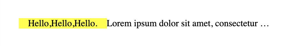
求めていたことが実現できていますね。
FYI #
上記挙動となる仕組みは以下の記事が詳しいです。
Why does this behave the way it does with max-width: 0? - Stack Overflow